

Here we'll try to break it down for you in a bite size easy to digest way .
Let's start with the colour wheel.

Monochrome
Choose a colour and then work with that in different shades and tones.
For example you choose blue violet and on the wheel you have 5 shades of violet which you design your room in using different colours shades (hues)

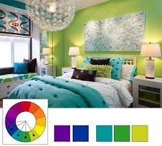
Analagous
Choose two or more colours that sit side by side on the colour wheel and you get whats called an Analogous or more commonly known as Contrasting or Harmonious colours.


Complementary Colours
These are the colours located on the colour wheel precisely opposite each other. Finding them is very simple: just draw a line from the colour sector of interest to you exactly through the circle’s center. For example, green is complementary to red, red-orange to blue-green, and yellow to blue-violet.
You will need such combinations if you want to create a spectacular and expressive interior. However, it is undesirable to use complementary colours in equal proportions: the colours will suppress each other and create an unnecessary visual disturbance.


These are some of the common ways the colour wheel can be used when planning your room design. However its always important to remember - its your home so you need to have the colours that are pleasing to you .